Sunday 5 April 2015

Final Presentation, Adaptions


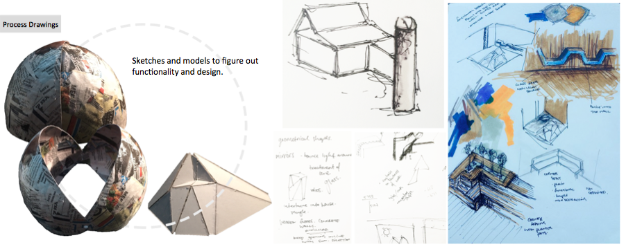
I have changed this slide by adding my sketches of my seat design for the space

This plan slide I had made separate to the section slide as I think it is easier to focus and look at the imagery itself. I have added the doors into the space also for access
The section is the same apart from the seat design on the far wall. It is hidden from the which concrete wall in the foreground here, but a bench seat is located against the far wall. I have added the seat as a detail to the left as I think the bench seat is a important aspect as it brings people in the space.


For the key perspectives, I have included the main image looking at the whole space with the geometrical wall to the right and the bench seat with cushions and a person sitting looking up towards the light. The smaller images show a different position that the bench could be sat on, a views of looking up towards to the sky light.

No comments:

Post a Comment