Sunday, 5 April 2015

Final Drawings

Plan
 Section

 Perspectives


Detail


Final Presentation, Adaptions


I have changed this slide by adding my sketches of my seat design for the space

This plan slide I had made separate to the section slide as I think it is easier to focus and look at the imagery itself. I have added the doors into the space also for access
The section is the same apart from the seat design on the far wall. It is hidden from the which concrete wall in the foreground here, but a bench seat is located against the far wall. I have added the seat as a detail to the left as I think the bench seat is a important aspect as it brings people in the space.


For the key perspectives, I have included the main image looking at the whole space with the geometrical wall to the right and the bench seat with cushions and a person sitting looking up towards the light. The smaller images show a different position that the bench could be sat on, a views of looking up towards to the sky light.

Seat Design

I have made the seat design on sketch up, and rendered it to see how it would look realistically within the space. The material of glass on the edges on the bench did not show up correctly, so I have deleted the material just to see how it would look with the light coming through. The bottom image, I have photoshopped a transparent glass look onto the area to see how it would look. I think it is a subtle feature, but it works well in the space acting as another light source. 


Tuesday, 31 March 2015

Seat Development


These seating ideas and designs are staying to the structured form as the large sky light and angular forms of concrete are very structured and straight. I think I will keep to this as otherwise the main focus in the room could become the seating space as it would contrast with the sky light area. The top drawing in the image above is what I am going to further develop and play with as it is built into the side wall, so would be made from wood, but the edge of the seat would be transparent. This would act as another light source just to create a bit more light entering the space - and a small feature that will hopefully work well with the rest of the space. Small cushions would be possible as it would make it softer and comfortable for the person to sit on. Also the different heights of the seating design could be used for various heights of people or you could sit in the lower ones and rest a coffee etc on the higher ones like a side table - enjoying the sunlight as you have your morning coffee, awakening and refreshing for the day ahead.

Interior Space Design

Within my space I have thought about the ritual being a morning thing relating to the bedroom and a bed, but in my designed space I feel as though a seat of some sort would fit better. This is because I have not designed it to be a bedroom, I am using my clients ritual and taking the aspects of it that I have incorporated already to stay away from replicating a natural light bedroom.

The direction of the seat I think would work best looking towards the sky light as this is the biggest feature in the space and also a grand one with the light. Visually it would be better to sit facing it than sitting on a seat from the skylight concrete piece facing towards the wooden wall.

My ideas are both of a separate seat and a built in seat. A built in one could add another element to the design but a functional one too.
Here I think the greenery is what makes this seat so appealing. It is an element I could bring in but I would want less than this as the space needs to be open and airy, instead of full and appearing like a green room.

Standard built in seat. Typically this is a wooden add on, as the seating itself can be covered with pillows for comfort and is realistically affordable.

A very clear cut window sill seating arrangement. I think this does need a window with it as this type of seat is usually just a "ponder" seat, but maybe my designs large concrete wall up to the opening sky light could be the feature to look at instead of an outside view.

This seat is separate from the building, but the design of the shape really interested in. The smooth lines of it (or similar design) could contrast well with the structured shapes of the concrete wall in the corner of my design.

Another built in seat with planter pots at the top. This looks clean and simple yet functional.

A shape/curve made out of the floor I think is completely different and interesting. The Idea could be used in multiple ways as you could sit on top of the bump, or lie in the lower downwards curve, and very possibly be a nice gradual line in relation to the human body form, making it comfortable, then add a couple pillows for that extra comfort. 

This image really stood out to me not as a window display but as a built in seat. If a similar shape was coming out of the wall, and the yellow area being transparent to the outside, it would act as another light source and a functional seat. Different heights of it would also accommodate for multiple heights of people but also a so called side table if someone was drinking a coffee etc.

Design Response to Final Feedback


In response to the critique on my design, I have looked at the space and how a person would occupy it. As the light and the geometric wall are the main focus piece, any further design cannot distract from this. Designing a seat/bench for sitting, the design of it needed not to be overpowering and to be apart of what is already in the space. The form of the piece of furniture would suit better if it was built in and structured like the current design and to ensure that it compliments the structured form that is already designed. This will make sure that it does not become the main focus of the room. The design I developed further was a bench seat made as an extension from the left wall. This would be made from wood and the edges would be transparent, acting as another light source into the space. This seat would make the space pleasant for someone to sit in and the seat would be subtle enough to not over power the geometric concrete wall and light. The bench seat could be covered in cushions for comfort. The different heights of the seats creates different functions, making lower and higher seating depending on where people want to sit in the space. The higher levels can also be used as a side table, acting as an area where a coffee could be placed while sitting in the lower seating areas. The angled sides allow for a person to lean comfortably and have their back supported, making a relaxed experience in the space.

Final Presentation Slides and Critique

 My clients ritual is to leave her curtains open during the night so she can wake up to the natural light of the morning. In response to her aesthetic gesture of markings of the light and shadows, I have acknowledged that the main aspect is natural light. The design will focus on the natural light of the day and make it a feature within the space. The design is to become closed and dark when the sun sets

The big idea is to have the suns path influence my design. I have looked into the suns path further and into the times of the day that it rises and sets. I wish to integrate this into my design and create a feature of light within the site. The design will allow for the suns path from a all seasons of the year and will maximize light throughout everyday day

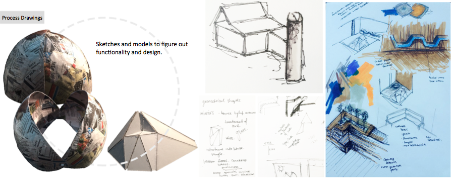
 These are my process drawings of trialing my idea. The dome shape opens and closes – with the timing of sun rise and sun set. I originally had the design at the back of the house as a separate area of house but by integrating it into the original house I furthered the design and angled it more specifically to the sun. The last model is me playing around with angles to create forms and structures to influence my design further.

 The designed area is an extension to the original house, featuring a wall with multiple angles to create a difference in the way the light falls into the space. This is the main light entry into the space which opens and closes at sun rise and sun set. Because only having this light source appeared to make the space quite dark, there is also a glass void also in line with the suns path, over the roof and down the back wall to let extra light enter.

 The yellow area over the left image is the variations of the suns path over the 4 seasons. I have made the opening of the design as wide as this to allow for the movement of the sun. The diagram on the right is the positions of movement of the design from sun rise through to the complete open design. This then repeats but backwards at sun set.


My perspectives from within the design. The three images on the left are all looking up at the design, seeing the light shine down into the space and creating different shadows on the thick wall with multiple angles.


CRITIQUE: following up my design, I should look at what is inside the space instead of it purely being just the light as the only thing. As it is a space for people, I could design an area for sitting or lying down etc that wold make the space more inhabitable. This potentially could be done by using the materials and structures there already and integrating a bench, bed or table that is an extension to the pre existing design. This will then make it more about the person, not just the light. Consider the placement of things as I have with the sun. Also lack of doors on my plan is something to add - as currently theres no view of doors, meaning no access for people throughout the whole house.